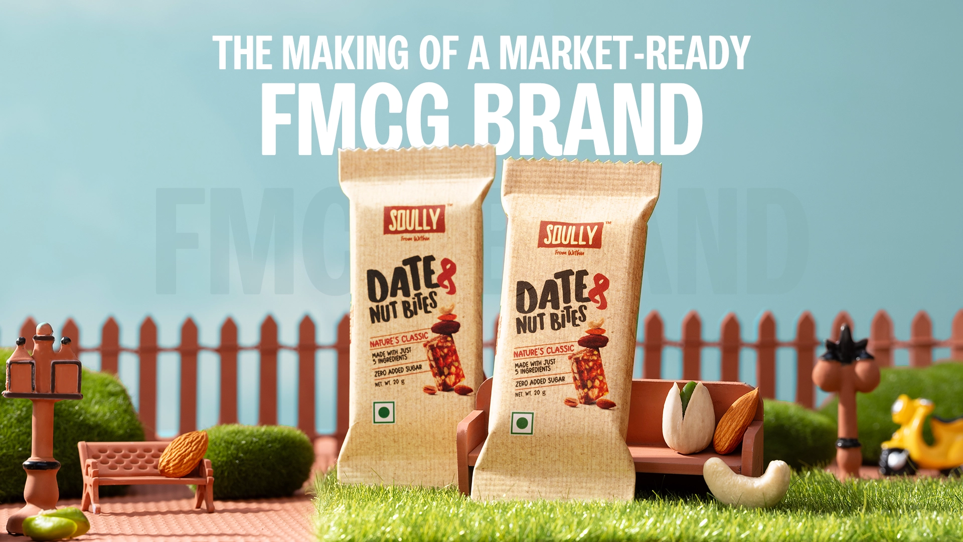
Equals Two (Healthcare): Digital Re-vamp
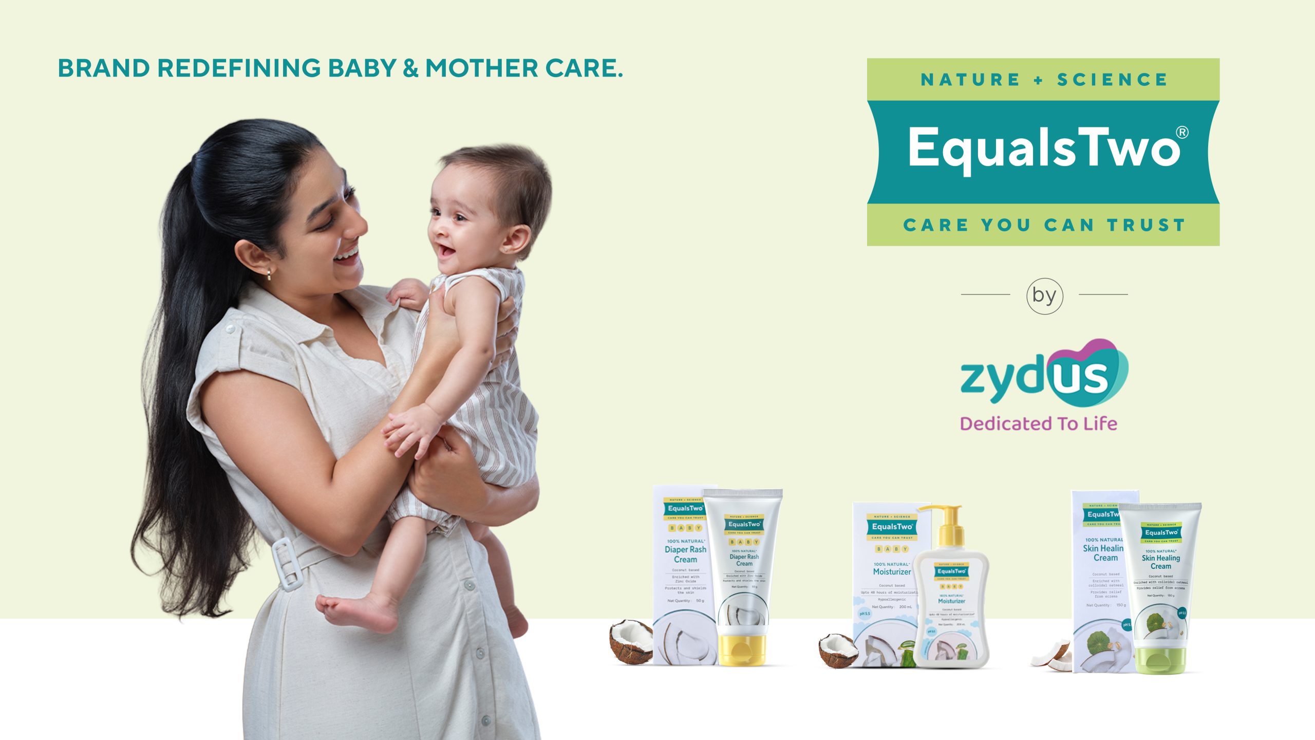
In the highly confusing and cluttering world of baby care and mother care products, Equals Two stood out with its promise of 100% natural origin, coconut-based formulations that are clinically and dermatologically tested. But with new packaging designed to bring its positioning, “Nature, Activated by Science”, to life, the brand needed more than just a redesign. It needed a thoughtful, comprehensive launch that would educate, reassure, and excite both doctors and parents alike.
Our brief was clear: Introduce the new packaging in a way that didn’t just look pretty on shelves, but built deep consumer trust and communicated clinical credibility.
Our Approach:
We understood that when it comes to caring for babies and mothers, trust is everything. So we developed a launch strategy rooted in clinical authority while remaining empathetic and easy to understand.
We began with the question: How do you prove science without losing the warmth? And we answered this with a set of content that blends the brand ethos and storytelling.
Content Strategy and Content Generation:
We started with the product films. Each film was carefully scripted to open with real problem statements that resonate with parents, then deliver clear, science-backed solutions. We included compelling statistics to strengthen credibility. Brand USPs and natural ingredients weren’t just mentioned, they were highlighted as the hero, reinforcing “Nature, Activated by Science” at every turn. We made sure the authority wasn’t abstract. The doctors featured in the content supported the brand’s dermatological testing claims and its reputation for safety and efficacy.
To simplify usage and boost consumer confidence, we produced dedicated product application videos for all 12 SKUs. Parents could see exactly how to use each product, removing guesswork and reinforcing transparency. Additionally, we understood that change can be confusing for loyal consumers. We shot creative transition reels that showed the shift from old to new packaging, making it clear, purposeful, and even inviting consumers to celebrate the new identity.
We developed an extensive visual library with white-background product shots for e-commerce clarity, product lifestyle imagery to showcase use in real environments, and model shoots featuring mothers, fathers, babies, and doctors to tell an authentic, holistic brand story.
Omnichannel Rollout
The new identity wasn’t just for the box; it had to live across every consumer touchpoint.
We redesigned the entire website experience to reflect the new packaging, brand tone, and clinically-backed storytelling. Even in Marketplace, every SKU was updated with new images, videos, and descriptions to ensure consistency and conversion on major e-commerce platforms. We also produced and deployed new performance creatives for awareness, consideration, and conversion stages, tailored to each funnel’s goals.
But we didn’t stop here. We teased the new look to build anticipation, then rolled out all the new content with a carefully staged launch plan across social media platforms.
The launch was more than just a packaging update; it was a brand transformation. The clinical yet natural positioning resonated with parents and doctors alike. The comprehensive rollout ensured that no matter where a consumer encountered Equals Two, the message was consistent: Trusted. Natural. Clinically Proven.
Visit website: https://equalstwo.com/