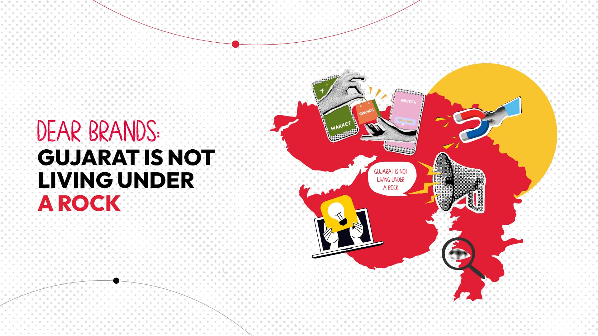
Dear Brands: Gujarat Is Not Living Under a Rock
An open letter to every brand still designing down, dumbing down, and dragging their feet.
You know that moment in a meeting when someone leans forward, half-whispering, “But… will people in Gujarat get it?” as if the entire state is still stuck buffering on 2G internet and emotionally invested in Times New Roman? Yeah, that. That sentence right there is the creative equivalent of deflating a balloon with a pin named fear. But sure, let’s keep pretending that your consumer who just binge-watched an Icelandic crime series on Netflix won’t “understand” a sleek Instagram grid. That the girl who bought Korean lip tint online can’t appreciate a clean, minimal layout. Or that the guy eating quinoa khichdi can’t vibe with a caption that doesn’t involve “offer ends soon.” The truth is—Gujarat’s audience is evolving faster than your marketing decks.
Because Gujarat isn’t sleeping under a design rock—it’s scrolling, shopping, screenshotting, and saving moodboards like the rest of the damn country. This idea that mass brands can’t look premium, or that clean aesthetics will scare people off like a GST raid? It’s not just tired—it’s tragically out of touch.
We’ve seen it happen again and again—bold campaign pitches with sleek black backgrounds, tight copy, minimal layout, and someone in the room goes, “But let’s add some bright colours, People might think it’s too fancy… too expensive.” Babe, people know how to read a price tag. They’re not buying with their eyes closed. They’re checking tags, reviews, sizes, and swipe-up links while eating gathiya.
Premium aesthetics doesn’t equal unaffordable anymore. It equals trustworthy.
It equals I want to be seen with this.
And let’s not just talk about Instagram grids here. This mindset trickles down into store branding, website UX, social media tone, and even packaging!
“Oh, let’s use a fun font because otherwise people will think it’s serious.”
“Let’s put a red border. Just in case they don’t notice it.”
Stop. Please. You’re not designing a newspaper ad from 2004. You’re building a brand in 2025.
Let’s throw it back for a second—Decades before, while SpiceJet was busy naming
their Bombardier Q400 aircraft “SHAHI JEERA”, Indigo freaking slapped the market with its quirky, fun branding and so called “India won’t get it” copies on plane.
Next?
To your surprise, no typical indian aunty gossiped how cookies jar saying “Feel the crunch, at 30,000 ft.” was not relatable.
No indian dad complained, how can you write “This too shall pass” on the sickness bags?
No indian family sat on a protest over naming their in-flight magazine 6E, a cheeky play on words (sounds like “sexy”). Instead, they consumed it like a piping hot biryani.
People said India wasn’t ready.
India said, “Hold my masala chai.”
And if India was ready at that time, you think Gujarat isn’t in 2025?
And here’s the deal—if your mass brand looks cheap, people treat it cheap.
But if it looks put-together, elegant, and confident? They trust it.
Because design speaks louder than discounts ever could.
So let’s stop diluting creativity because we’re scared.
We admit, Gujaratis might be loud speakers, but they don’t need loud branding to listen.
Let’s stop acting like minimal is “for Mumbai.”
Dear Brands & Agencies,
Be brave. Be bold. Be spicy.
Gujarat is ready.
The real question is—are you?
Read More Articles: